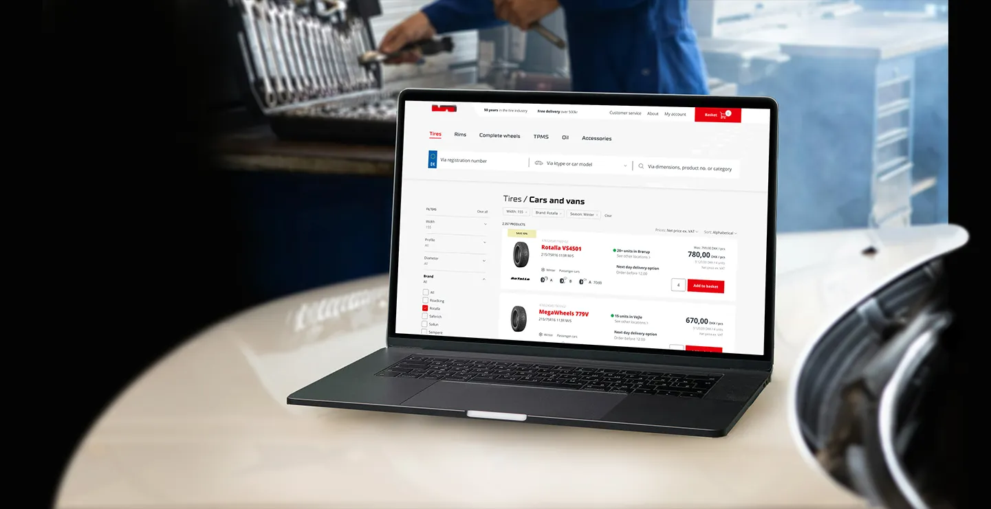
Whiteaway Group managed the unique design of seven brands across eleven webshops in the Nordics. A centralized design system with an integration to CMS would ease the codebase maintenance and allow for faster design iterations. First establishing a common foundation, building flexible components and at last creating complex features that could be reused across our sites.
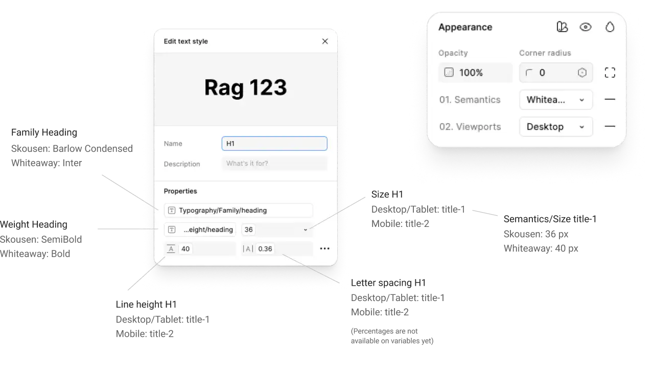
We went with color variables naming based in semantics. It had a three-color variant structure (subtle, default and strong) that worked independently of the chosen hexcode. I set the variable structure up in Figma for typography, colors and radii to be quickly able to change between brand and viewport mode.
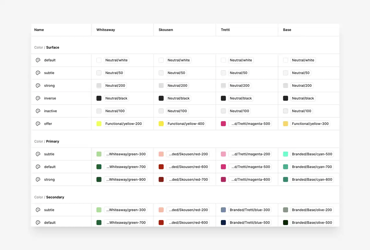
All styles connected with variables.
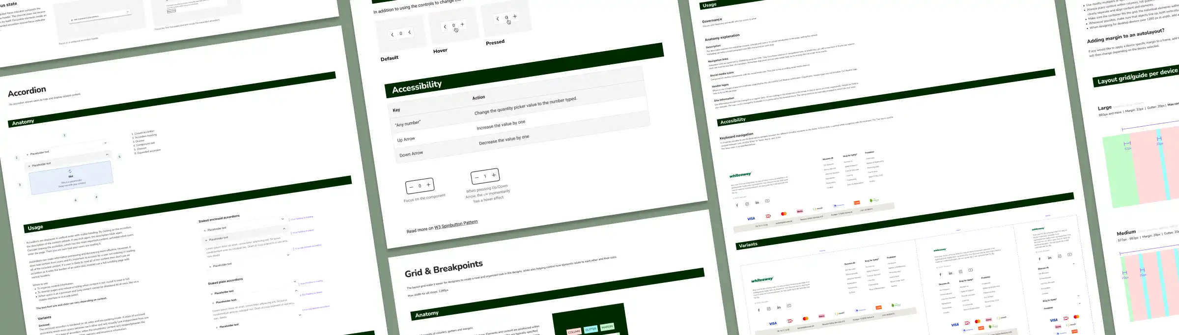
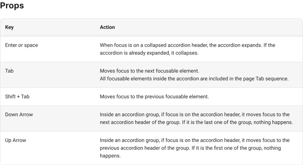
I reviewed all our components to ensure they follow WCAG accessibility criteria: testing and defining keyboard navigation patterns, creating a global and component specific focus indicators, and setting aria labels in place On just the front page we were able to reduce the number of errors from over 200 to 3!
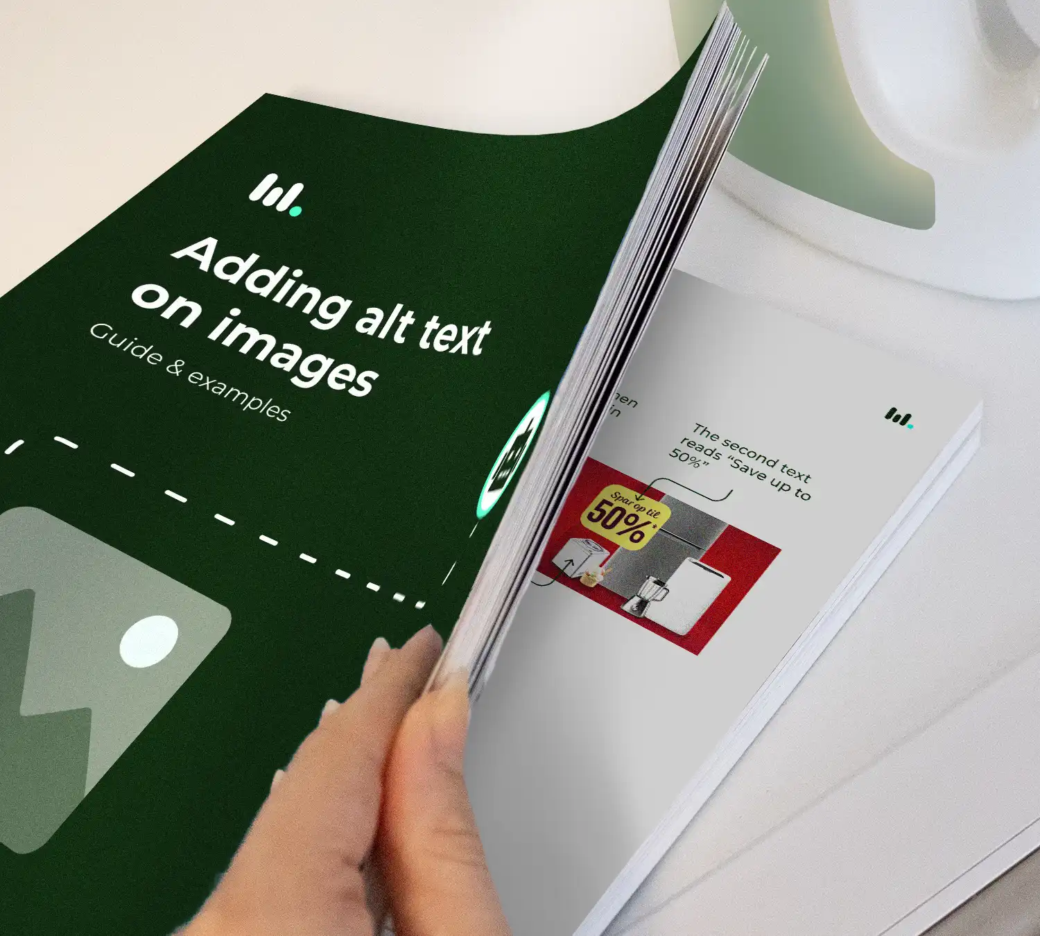
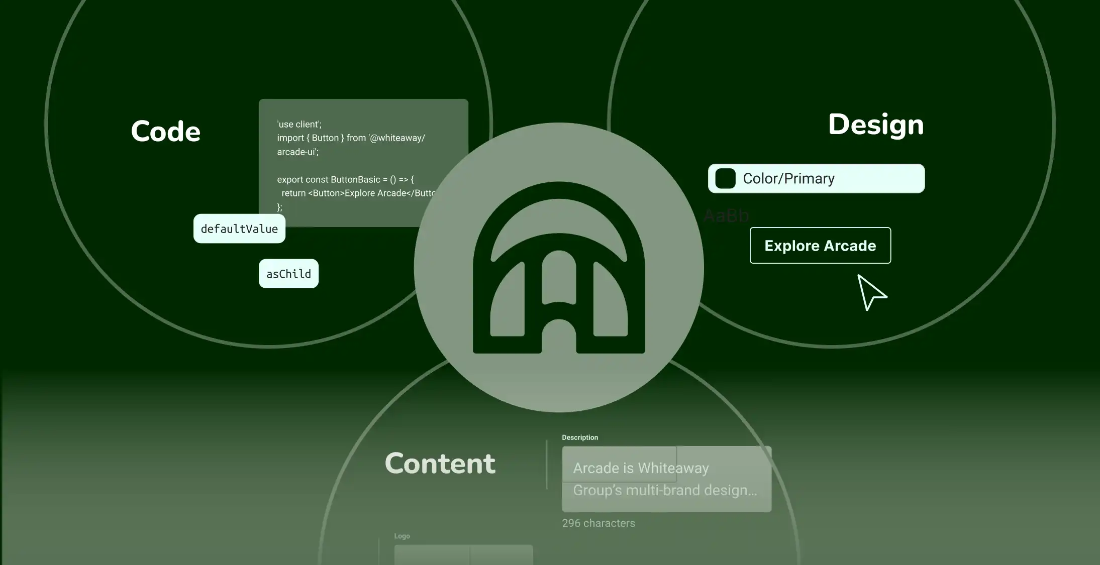
It was clear that to support the design system’s growth, we needed a common space for understanding between disciplines and a playground to explore how the interface reacts across brands. I designed Arcade’s documentation page. It combined component guidelines of its use in the UI design, in the code and with content.